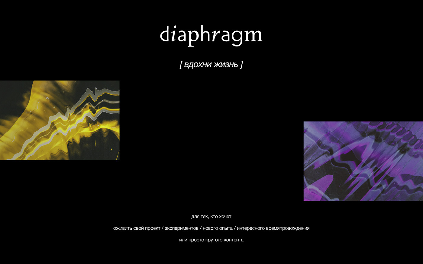
RU/
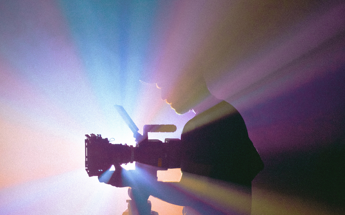
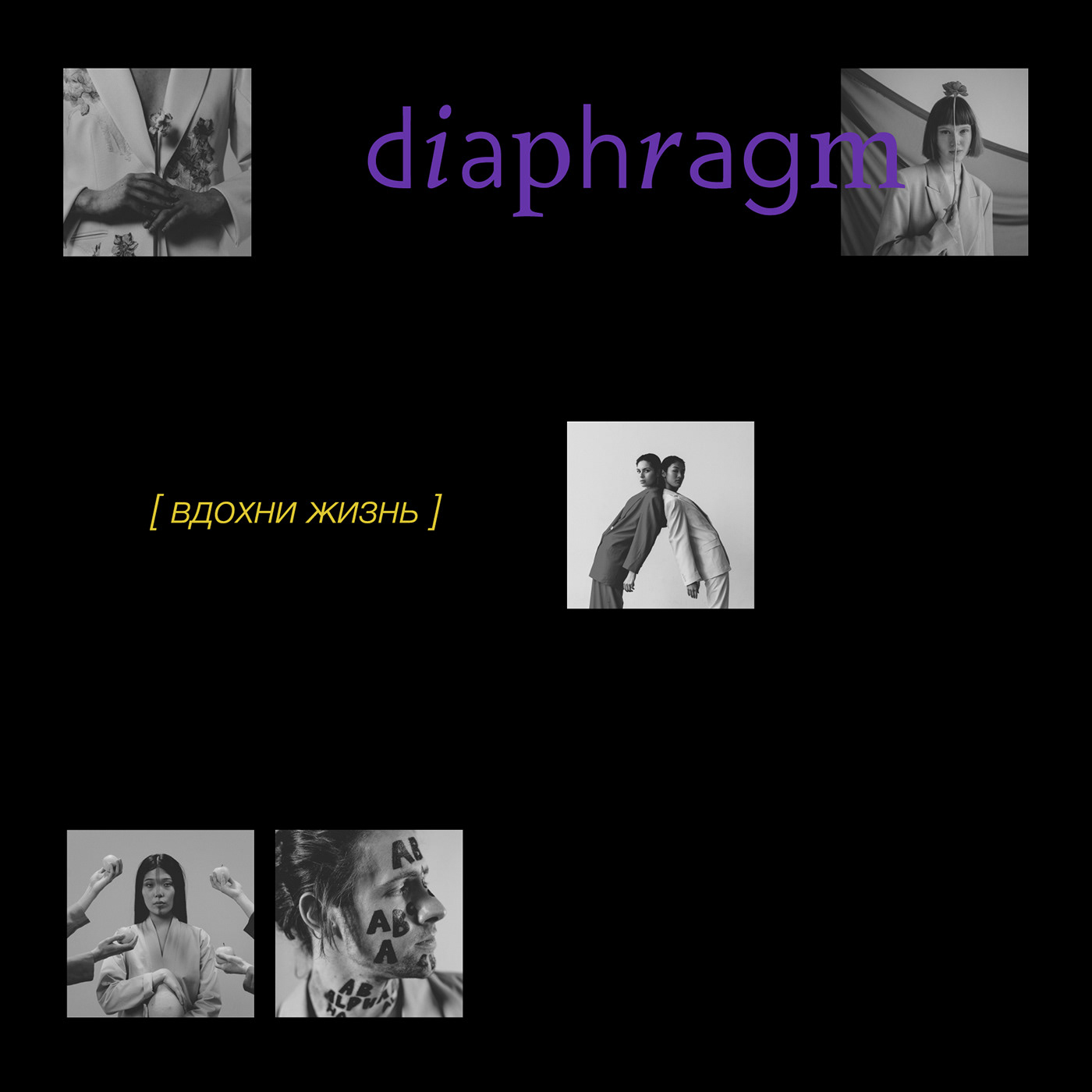
Diaphragm – это не просто фотостудия, которую вы можете арендовать и самостоятельно фотографироваться. Это целое арт пространство, которое предоставляет различные локации для ваших съёмок на любой вкус и имеет множество декораций и реквизита, которыми также можно воспользоваться: проектор, парики, светодиоды, необычная одежда и многое другое. В «диафрагме» работает команда из фотографов, ретушеров, стилистов и визажистов. Вы можете воспользоваться их услугами, а можете организовать съемку самостоятельно.
EN/
Diaphragm is not just a photostudio that you can rent and take pictures of yourself. This is a whole art space that provides different locations for your shoots for every taste and has a lot of scenery and props that you can also use: a projector, wigs, LEDs, unusual clothes and much more. “Diaphragm” has a team of photographers, retouchers, stylists and make-up artists. You can use their services, or you can organize the shooting yourself.

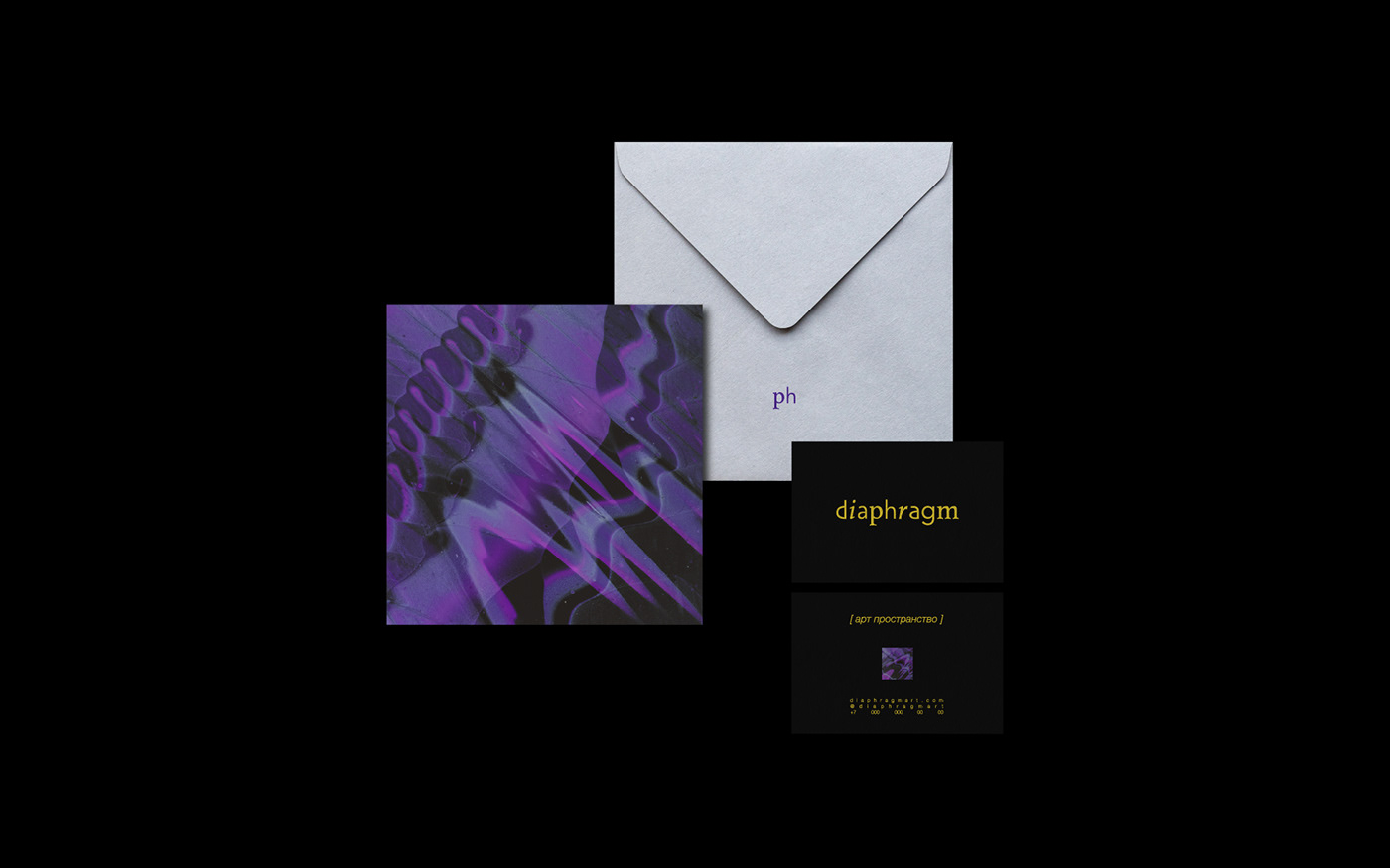
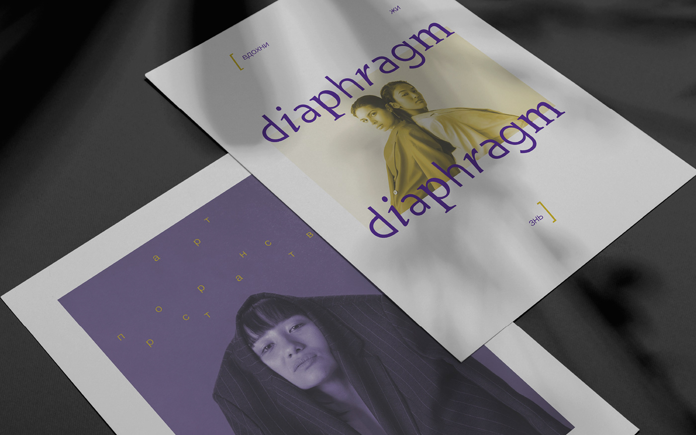
RU/
Буквы в логотипе подобраны максимально разные по шрифтам и начертаниям, но несмотря на это, они гармонируют между собой, визуально создавая единую концепцию. Это сделано для того, чтобы показать, что «диафрагма» может помочь в организации совершенно разных съёмок – от экспериментальных до самых обычных, прямо как буквы; но вне зависимости от задачи, на выходе обязательно получится что-то интересное.
EN/
The letters in the logo are selected as different as possible in fonts and styles, but despite this, they are in harmony with each other, visually creating a single concept. This is done in order to show that the "diaphragm" can help organize completely different shootings - from experimental to the most ordinary, just like letters; but regardless of the task, in the end, something interesting will definitely turn out.